Tina Banko G324 Media Studies Blog
Time Flies...
Wednesday, 27 April 2011
Evaluation Task 4 How did you use new media technologies in the construction and research, planning and evaluation stages?
This is me using Photoshop to transform a feather for my Teaser Poster. Photoshop was a vital tool in making the Teaser Posters and Magazine Front Cover. It allowed me to manipulate images to my liking.
Blogger was used to publish all my research and my teaser trailer.
I really only used Youtube to post my Teaser Trailer however I also used it to get the Wing Clip from Final Fantasy 7 Crisis Core.
Adobe Premiere Effects was another key component in my Year 13 Teaser Trailer project as it was the program I used to edit my film and then upload it.
This is a tripod and camera I used to film my teaser trailer. It was a useful tool.
Friday, 15 April 2011
Thursday, 14 April 2011
Evaluation Task 2 How effective is the combination of your main product and ancillary texts?
Annotated version of my film. Please pause to read if its to fast.
My main project and ancillary task share many things in common to link the two together. For starters; the logo. The Sky Angels logo appears on each poster along with the tag line which is also appears at the end of the trailer. And each one contains the website.
I also linked them together by color scheme. So like when Dawn's name appears in the Teaser Trailer, its in gold which is the color of the wings and text on her poster (the second poster by the way).
One of the things I think really attracts audiences is the contrast of the whole project. In the video its bright blue text on black then changes to black on red. The posters and magazine front cover have black backgrounds as well but very bold color to make them stand out.
The hands, like the text at the end of the Teaser, provided me with a way to get more characters into my piece. Since it would have taken me too much time to photoshop real people into my characters, I decided it would be a lot easier to go down the Tron route and just photoshop people's hands (mainly mine).
Wednesday, 13 April 2011
Evaluation Task 1: In what ways does your media product use, develop or challenge forms and conventions of real media products?
Click to Enlarge
-I have created a very unconventional teaser trailer. Unlike most, I went down the slow and ominous route. Due to lack of CGI, I was forced down this path but in a sense its fitting as the story its based of is very unconventional. Although there are a few things I kept the same; like the title and "coming soon" appearing at the very end. The costumes, location and props were very basic due to low budget however I still believe it fits.
-The story is based off a novel I have written so I had everything clearly laid out in my head. Again, lack of CGI prevented me from going very far but I feel the teaser trailer represented this story well through the use of voice overs. The destiny read out gives an idea of the plot like most fantasy prophecies do.
-The main character is slowly introduced. The first shot is an opening of her but you can't see her face yet. Then its a couple of medium shots. The main character is not fully revealed until the very end when she runs towards the camera.
I have very little special effects except for the transitions between shots. This keeps the trailer very simple.
-While I have said my story is quite unconventional, the main character, at times, can fall into that very girly herione type stereotype. She can act impulsively at times. This is shown here as she's running straight towards her burning house. The female villain at the end falls into the sadistic bitch stereotype which is clear by her scary smile.
-I didn't make the audience very clear in this piece, I realise, although with the villain at the end its most certainly not a kids film. And with the destiny being read out; its quite dark. I'd like my film to be for teens and older however.
Wednesday, 30 March 2011
Tuesday, 29 March 2011
Monday, 14 March 2011
Teaser Poster 3 Em
For starters, I used this: http://browse.deviantart.com/?qh=§ion=&global=1&q=Fire+in+Photoshop#/ddhyhu as reference on how to make fire.
This was the orginal image that I manipulated.
The Teaser Poster:
As you can see, I added the fire effect but also cleaned up my skin to be more smooth and darker (at least to the best of my ability).
This was the orginal image that I manipulated.
The Teaser Poster:
As you can see, I added the fire effect but also cleaned up my skin to be more smooth and darker (at least to the best of my ability).
Monday, 28 February 2011
Teaser Poster 2 Dawn
My second teaser poster (2 of 5) featuring the main character's hand. The crystal is the first gift given to her by her friend and she always wears it throughout. This time round, I fiddled with the effects a bit more like shrinking the tag line text and increasing the logo. As my teacher pointed out I kind of forgot a date however I do have the website so curious fans can go see it for themselves or watch the Teaser Trailer.
This is the orginal photo I manipulated. Its my hand. For instance I smudged out the blemishes to a smoother texture and made my nails cleaner and longer.
Friday, 18 February 2011
Teaser Poster 1 Z
Monday, 7 February 2011
Film Magazine Research
After a bit of research I've decided to do a Film Magazine Cover for SFX; the Sci-fi/Horror/Fantasy Movie Magazine.
Sample Posters:
As you can see each cover is slightly different with how much content on the cover. I like the Watchmen cover the best as its just focussed on the image. Its very bold. With each of the covers though, a thing to note is the 'SFX' Logo is always at the top; sometimes behind or front of the image.
Wednesday, 26 January 2011
Teaser Poster Practice
Sky Angels Logo
Monday, 24 January 2011
Film Diary
So today, 24/1/11, I shall be filming a majority of my teaser. Mainly the walking scenes around the school following my main character. I already got one shot done in front of the lockers so this shouldn't take long at all.
Friday, 21 January 2011
Teaser Poster Analysis
I chose these four teaser posters to analyze because they are the most similar to what I have in mind for my Teaser Poster.
Tron-
I love the close up of the hand in this one as it so simply shows its Tron without even revealing actors. I feel its a really well done Teaser Poster. I believe it would also be very easy to replicate in Photoshop.
The Box-
I love the basic color scheme of this poster; the black, white and red makes the brown box in the middle stand out. The big, bold red text also draws your attention. This is a quite unusual poster as it lists the main actress, the release date and director info however this could be linked to how its a big budget film and they can afford to select a date.
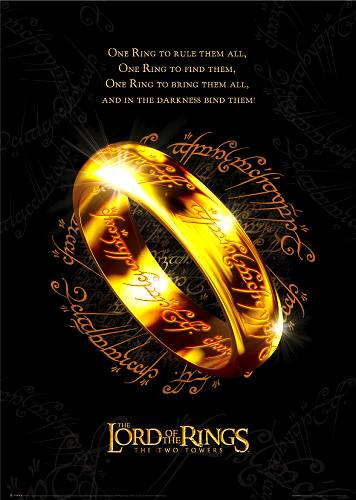
Lord of the Rings-
Instantly recognisable poster. Again, I liked this one for the bold color scheme; gold against black. This really catches a person's eye and as its based off a popular book, people know it. It doesn't even have a date or website (though given the time, websites weren't as popular yet for advertising film).
Tuesday, 11 January 2011
Storyboard Animatic
Please note that timing is not precise. The actual teaser will probably be a couple seconds longer.
Sunday, 9 January 2011
Audience Profiling
Saturday, 8 January 2011
Audience
Thursday, 16 December 2010
Location, Location, Location
Monday, 6 December 2010
Shot List
Shot 1: Black screen with voice over and titles
~Fade To~
Shot 2: Close up shot of girl in a uniform walking; face not shown
~Fade To~
Shot 3: Black screen with voice over and titles
~Fade to~
Shot 4: Slight low angle medium shot of same girl lying on the grass as a shadow of a winged figure passes over her.
~Fade To~
Shot 5: Black screen with voice over
~Fade To~
Shot 6: Medium shot of girl standing in front of locker as another girl joins her smiling
~Fade To~
Shot 7: Black screen turns to red with voice over
~Fade To~
Shot 8: Close up of main girl turning her head slowly with wide eyes
~Fade To~
Shot 9: Red screen with voice over
~Fade To~
Shot 10: Wide shot of girl turning to run in slow motion
~Fade To~
Shot 11: Red screen with voice over
~Cut To~
Shot 12: Wide, long shot of girl running up to the camera before stopping and screaming her best friend
~Zoom~
Shot 13: Camera zooms out then turns
~Fade To~
Shot 14: Variety of images zooming towards the screen with incoherent voices screaming under Dawn’s voice.
~Cut To~
Shot 15: Close up of new female’s mouth speaking
~Cut To~
Shot 16: Long, wide shot of a villain sitting in a dark room
~Fade To~
Shot 17: Black screen with final titles
~Fade To~
Shot 2: Close up shot of girl in a uniform walking; face not shown
~Fade To~
Shot 3: Black screen with voice over and titles
~Fade to~
Shot 4: Slight low angle medium shot of same girl lying on the grass as a shadow of a winged figure passes over her.
~Fade To~
Shot 5: Black screen with voice over
~Fade To~
Shot 6: Medium shot of girl standing in front of locker as another girl joins her smiling
~Fade To~
Shot 7: Black screen turns to red with voice over
~Fade To~
Shot 8: Close up of main girl turning her head slowly with wide eyes
~Fade To~
Shot 9: Red screen with voice over
~Fade To~
Shot 10: Wide shot of girl turning to run in slow motion
~Fade To~
Shot 11: Red screen with voice over
~Cut To~
Shot 12: Wide, long shot of girl running up to the camera before stopping and screaming her best friend
~Zoom~
Shot 13: Camera zooms out then turns
~Fade To~
Shot 14: Variety of images zooming towards the screen with incoherent voices screaming under Dawn’s voice.
~Cut To~
Shot 15: Close up of new female’s mouth speaking
~Cut To~
Shot 16: Long, wide shot of a villain sitting in a dark room
~Fade To~
Shot 17: Black screen with final titles
Title Idea
I was thinking for nearer to the end of my teaser trailer of having a load of images flying towards the screen. This effect is not possible in Preimere but I'm going to try and use Flash CS4 and hopefully be able to import the file. If it works, should be good.
Script
Tito: A female Earthling, with the name of the rising sun.
Black screen- From the best selling author Augustina Banko
Scelia: Shall rise to the skies on wings of gold and defeat the Darkness.
Black Screen- and director Peter Jackson
Z: But in Sacrifice…
-Black screen changes to red-
Em: She will become the most powerful Dark Lord ever to rule the lands.
Jud: And a new age of blood and darkness will reign…
Dawn: EEEEEEEEEEEEELLLLLLLLLLLLLLLLLLLVAAAA!!!!
~various quotes from the above characters overlapping each other~
Dark Lord: Dawn.
Title Appears
Voice Over: Everyone has secrets… some they do not know about themselves…
Black screen: Summer 2012, find out more at FindFlyers.com
Friday, 19 November 2010
Ideal Music Ideas
This may be a trailer but I like how they mix the various songs to build tension. It starts with the slow beginning of Epicon before building the climax with the ending of Diem Ex Dei and finishing with a seductive violin. A great thing to consider for my own teaser trailer.
Various other songs I could use include:
Serenata Immortale
Lacrisoma Dominae (For maybe the fast part of the Teaser Trailer)
Europa (A song that slowly builds up nicely)
Of course I realized I am not allowed to use copyrighted music but a lot of the songs on the free music website are very similar to these with only a few beats off.
Monday, 8 November 2010
Kung Fu Panda 2 Teaser Trailer
Just because this one was really funny.
Its quite obvious this footage was made for the Teaser Trailer as the main character talks to the audience. The story is not revealed however Jack Black, the voice actor of the main character, is listed. The music is the stereotypically associated with Chinese Kung Fu movie.
Questionaire
Here's a questionaire I designed for my Teaser Trailer. The results will be up soon.
1. What sort of Teaser Trailers catch your attention?
Ones with big action; explosions!!!
Ones that are mysterious; don’t reveal much
Ones which pretty much tell you the whole story
Ones that look high quality
Ones where you recognize the actors/directors
2. How do you think a Teaser Trailer should be?
30 Seconds
1 Minute
1 minute 30 seconds
2 minutes
2 minutes 30 seconds
Longer
3. Male or Female?
Female
Male
4. When the movie’s based off a book what do you expect to see? (write your own response)
5. What kind of music makes a teaser trailer attractive?
Fast and epic (e.g. Globus, Immediate Music)
Slow and creepy
Upbeat and happy
Sad and soft
No Music
6. Have you ever gone to see a film just based off the trailer?
Yes
No
Sunday, 31 October 2010
Hook Teaser Trailer
Another great example of a teaser trailer. Once again its based off a book (well more like a sequel to a book).
There is very little narrative other than its surrounding the villain of the popular book, Peter Pan. Other than that, we know nothing more. The actors are listed however its not said whom they are playing.
The music has a pirate theme to it and the map suggests it once again a pirate movie.
It is clear the footage was made just for the trailer.
Monday, 18 October 2010
Pirates of the Caribbean Teaser Trailer Analysis
This is a great example of a Teaser Trailer.
It's quite clear, the footage was made just for the trailer and the only shot from the movie is the close up on the skeleton foot. The film is based off the ride at Disney world (hard to believe it ended up such a success... at least the first one). However, unlike with books, the number of people who have actually riden the ride is much lower and the fact that probably most people wouldn't know it was based off it. Because its a Jerry Bruckheimer and Disney film, they can afford to announce who the actors are.
The narrative is hinted at but not made clear. All we learn is there is a possible curse. (Though that could be worked out from the title; Pirates of the Caribbean Curse of the Medallion
Wednesday, 13 October 2010
Plan: Idea 1
As I stated before how a lot of my teaser trailer will be difficult to film due to lack of CGI, I've come up with a way around that yet showing all the characters (relatively).
In my novel, eye colours have a huge signifigance such as Flyers have silver eyes while Waterlings have pure black eyes and the villains all have orange eyes and so on and so forth. So basically, I've started taking pictures of all my friends eyes and photoshopping them to the different colours and stuff. Here's one I completed just recently:
I think this actually looks really good. These are a pair of Flyer eyes. In my trailer, the images will move to fast that people shouldn't catch the mistakes.
Wednesday, 6 October 2010
Buried Teaser Trailer
A horror teaser trailer.
This is quite a simple but effective Teaser Trailer. We get from the Title that this Rey Ronald's has been buried alive and then from the 911 call he makes, he doesn't remember getting there. The genre is kind of a hyrbrid betwen horror, thriller and mystery. Its USP is being buried alive which is a lot of people's worst nightmare. The trailer is also very orginal. Because of this, the audience will be quite old maybe older teens (16) to adults (30).
It has very tense humming music which crescdo's into a high pitch frequency. The pace is rather fast due to his heavy panting while the pace of the clips is quite slow. The dialogue is a 911 call which is abruptly cut.
All that comes up for titles is the Lionsgate logo, the title and then "Coming Soon" with the film's website beneath it. Lionsgate is often associated with quality horror films such as Saw and The Haunting in Conneticut (apart of the Haunting series).
I might use a lot of black screen with voices cause its quite effective for building tension.
Research: Harry Potter 1 Teaser Trailer
Another famous book to movie adaptation.
Once again, the difficult thing is fans will know the story however the Teaser Trailer doesn't reveal much of the story other than that Harry is to become a Wizard. The teaser is a bit on the long side with a lot of long cuts which could suggest it be a boardline Teaser. Something to think about for my own film.
Research: The Last Airbender Teaser
This movie is based off a popular American-Anime show which is based off a book; its a still adapation.
Anyways, this is clearly a Teaser Trailer. Its quite obivious, this footage was only filmed for this trailer (though only those who have seen the show will know this). As soon as people see the name, they instantly know the story. Only M. Night Shyamaian is announced who is well known for films like the Sixth Sense, Signs and the Village. Although his work has been slipping of late so a lot of the Last Airbender fans were extremely nervous when this trailer was released and they turned out to be right.
Research: LotR's Fellowship of the Ring Teaser Trailer
This is quite an interesting Teaser Trailers. This was one of the firt trailers released for the Lord of the Rings series. Because my film idea is based off my novel, I'm looking to study fantasy films were are aptations from books. One key thing to note is fans who have already read the books pretty much know the story.
The reason I classed this as a boardline teaser trailer is cause while it shows all the actors and stuff, the story isn't revealed. Only fans will recongize like the catch phrase, "One ring to rule them all etc." and immediately go, "Oh its Lord of the Rings!" I think its also interesting to note that this trailer was made in early days cause they had a lot of scenes with the characters' costumes still being made and green screens.
And because this is a big budget production (directed by Peter Jackson and produced by New Line Cinema) they were able to announce rougly their release date; Christmas 2002, Summer 2003, Christmas 2003.
So for my film, I may not have to worry so much about the story being revealed since its based off a book which a lot of people have read.
Friday, 1 October 2010
Thursday, 30 September 2010
Finding Nemo Teaser Trailer Analysis
Pixar is a great genre to study for Teaser Trailers due to their randomness. I have chosen the teaser trailer for Finding Nemo. This scene does appear in the movie but only partially. I have made a few notes on this:
- Like how most films name their directors and produces, Pixar creates hype their association to past films which is why they list those in each trailer.
- The plot isn't revealed through this two fish other than they're lost. But it doesn't even mention Nemo.
- Also similar to Pixar films is its use of colours. Marlin in orange, Dory is blue the coral is pink etc. This attracts kids.
- While not listed, Dory's voice can be recognized to be Ellen DeGeneres who has a huge falling and will attract adults who like her.
- Its quite funny, even though the actual plot is on the serious side
- Its quite long for a Teaser Trailer but again, its not revealing anything important
Wednesday, 22 September 2010
Yr 12 Opening Two Minutes Teaser Trailer Shot List
Our teacher challenged us to write up a shot list; turning our Opening Two Minutes into a teaser trailer (including the whole plot), so here's mine.
Shot 1: Black screen with voice over reading white words, "I didn't ask for this."
Shot 2: Low angle mid shot of Villain smiling
Shot 3: Wide shot of burning Kingdom
Shot 4: Boy again, "I was just hungry."
Shot 5: Long shot of group of guards shouting, "STOP THIEF!"
Shot 6: "But here I am now."
Shot 7: Long, wide shot- Princess sliding at fork in the road
Shot 8: Mid shot- Princess running towards camera
Shot 9: Mid shot of boy running from guards
Shot 10: Black Screen- From the Director of Sky Angels
Shot 11: Low angle canted- Vivian walking under a bridge
Shot 12: Establishing shot of entire Kingdom
Shot 13: Wide shot of two people charging towards each other with swords raised
Shot 14: Over the Shoulder of swords clashing
Shot 15: Zoom out of girl screaming
Shot 16: Birds eye view pan of group of kids running through a field
Shot 17: Cut out to a wide shot of the entire field with them just barely being made out
Shot 18: Black Screen- "And from the Producers of Lord of the Rings"
Shot 19: Close up of main boy raising sword
Shot 20: Cut to long shot of same clip
Shot 21: Cut to wide shot of boy standing on the top of moutain with the sword starting to glow
Shot 22: Close up of colourful umbrella
Shot 23: Close up of villain's smile
Shot 24: Close up of a hand reaching towards something
Shot 25: Close up of sword being drawn from sheath
Shot 26: Wide shot of entire group of heroes
Shot 27: Close up on boy 1
Shot 28: Close up on boy 2
Shot 29: Close up on girl
Shot 30: Close up on girl 2
Shot 31: Close up on boy 3
Shot 32: Close up on main character
Shot 33: Medium shot of puma growling
Shot 34: Medium high angle shot of a man being flogged
Shot 35: Wide shot up of ballroom
Shot 36: Medium shot of villain and young woman dancing together
Shot 37: Wide shot of girl rolling down hill
Shot 38: Close up of girl landing
Shot 39: Wide shot of girl running through forest
Shot 40: High angle of girl with umbrella walking under bridge
Shot 41: Medium shot of her dying
Shot 42: Worm's eye view of villain looming over
Shot 43: Title
A bit random but its meant to be really quick.
Shot 44: Coming 2012
Super 8 Teaser Trailer Analysis
- Very dark- slight horrow feel to it
- White on black titles- very basic but effective
- Area 51 suggests alien film
- Creepy, horror like music
- Documentary narrative
- No actors revealed and no real hint to the story
- Loud crash and bang after long silence for jump scare
- Spielberg's and Abram's names are revealed giving people the idea this is going to be a quality film based on their previous works (Jaws, Lost etc.)
- Monster like gurgling sound after train crash
- Fiction masking as fact, "Could this really have happened?"
- Confusion, "Why did the truck crash into the train?"
- "Next summer, IT arrives"- Hinting that whatever is in the train, isn't human
- Viral Marketing (first posted on a website)
- Pragmatic knowledge required to know a Super 8 is a type of camera (hence the lens at the end).
Conventions of Teaser Trailers
- Short snappy shots
- Between 30-60 seconds long
- Its purpose is to create hype; snowballing
- Some teaser trailers film footage just for the trailer
- End of trailer- Title then "Coming Soon" (No clear date is given yet since its so far ahead
- Not about Narrative or plot
- Often about genre and emotional feeling (scary, heartfelt, sad, happy etc.)
- Wrapped in enigma
Monday, 20 September 2010
Subscribe to:
Posts (Atom)