
Tron-
I love the close up of the hand in this one as it so simply shows its Tron without even revealing actors. I feel its a really well done Teaser Poster. I believe it would also be very easy to replicate in Photoshop.

The Box-
I love the basic color scheme of this poster; the black, white and red makes the brown box in the middle stand out. The big, bold red text also draws your attention. This is a quite unusual poster as it lists the main actress, the release date and director info however this could be linked to how its a big budget film and they can afford to select a date.
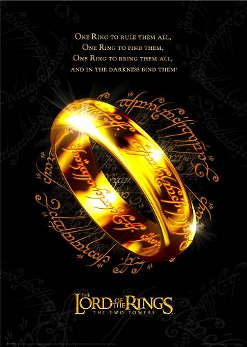
Lord of the Rings-
Instantly recognisable poster. Again, I liked this one for the bold color scheme; gold against black. This really catches a person's eye and as its based off a popular book, people know it. It doesn't even have a date or website (though given the time, websites weren't as popular yet for advertising film).
No comments:
Post a Comment