Time Flies...

Wednesday, 27 April 2011

Evaluation Task 4 How did you use new media technologies in the construction and research, planning and evaluation stages?


This is me using Photoshop to transform a feather for my Teaser Poster. Photoshop was a vital tool in making the Teaser Posters and Magazine Front Cover. It allowed me to manipulate images to my liking.


Blogger was used to publish all my research and my teaser trailer.


I really only used Youtube to post my Teaser Trailer however I also used it to get the Wing Clip from Final Fantasy 7 Crisis Core.


Adobe Premiere Effects was another key component in my Year 13 Teaser Trailer project as it was the program I used to edit my film and then upload it.


This is a tripod and camera I used to film my teaser trailer. It was a useful tool.

Thursday, 14 April 2011

Evaluation Task 2 How effective is the combination of your main product and ancillary texts?

Annotated version of my film. Please pause to read if its to fast.


My main project and ancillary task share many things in common to link the two together. For starters; the logo. The Sky Angels logo appears on each poster along with the tag line which is also appears at the end of the trailer. And each one contains the website.
I also linked them together by color scheme. So like when Dawn's name appears in the Teaser Trailer, its in gold which is the color of the wings and text on her poster (the second poster by the way).
One of the things I think really attracts audiences is the contrast of the whole project. In the video its bright blue text on black then changes to black on red. The posters and magazine front cover have black backgrounds as well but very bold color to make them stand out.
The hands, like the text at the end of the Teaser, provided me with a way to get more characters into my piece. Since it would have taken me too much time to photoshop real people into my characters, I decided it would be a lot easier to go down the Tron route and just photoshop people's hands (mainly mine).

Wednesday, 13 April 2011

Evaluation Task 1: In what ways does your media product use, develop or challenge forms and conventions of real media products?

Click to Enlarge


-I have created a very unconventional teaser trailer. Unlike most, I went down the slow and ominous route. Due to lack of CGI, I was forced down this path but in a sense its fitting as the story its based of is very unconventional. Although there are a few things I kept the same; like the title and "coming soon" appearing at the very end. The costumes, location and props were very basic due to low budget however I still believe it fits.

-The story is based off a novel I have written so I had everything clearly laid out in my head. Again, lack of CGI prevented me from going very far but I feel the teaser trailer represented this story well through the use of voice overs. The destiny read out gives an idea of the plot like most fantasy prophecies do.

-The main character is slowly introduced. The first shot is an opening of her but you can't see her face yet. Then its a couple of medium shots. The main character is not fully revealed until the very end when she runs towards the camera.
I have very little special effects except for the transitions between shots. This keeps the trailer very simple.

-While I have said my story is quite unconventional, the main character, at times, can fall into that very girly herione type stereotype. She can act impulsively at times. This is shown here as she's running straight towards her burning house. The female villain at the end falls into the sadistic bitch stereotype which is clear by her scary smile.

-I didn't make the audience very clear in this piece, I realise, although with the villain at the end its most certainly not a kids film. And with the destiny being read out; its quite dark. I'd like my film to be for teens and older however.

Monday, 14 March 2011

Teaser Poster 3 Em

For starters, I used this: http://browse.deviantart.com/?qh=§ion=&global=1&q=Fire+in+Photoshop#/ddhyhu as reference on how to make fire.

This was the orginal image that I manipulated.


The Teaser Poster:


As you can see, I added the fire effect but also cleaned up my skin to be more smooth and darker (at least to the best of my ability).

Monday, 28 February 2011

Teaser Poster 2 Dawn

My second teaser poster (2 of 5) featuring the main character's hand. The crystal is the first gift given to her by her friend and she always wears it throughout. This time round, I fiddled with the effects a bit more like shrinking the tag line text and increasing the logo. As my teacher pointed out I kind of forgot a date however I do have the website so curious fans can go see it for themselves or watch the Teaser Trailer.


This is the orginal photo I manipulated. Its my hand. For instance I smudged out the blemishes to a smoother texture and made my nails cleaner and longer.

Friday, 18 February 2011

Teaser Poster 1 Z

I'm doing a series of Teaser Posters, 5 in total, and this is the first one. I manipulated my teacher's hand from this:


To this:

Monday, 7 February 2011

Film Magazine Research

After a bit of research I've decided to do a Film Magazine Cover for SFX; the Sci-fi/Horror/Fantasy Movie Magazine.

Sample Posters:


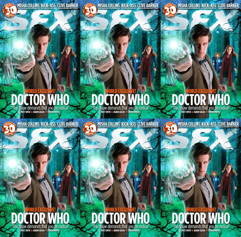
As you can see each cover is slightly different with how much content on the cover. I like the Watchmen cover the best as its just focussed on the image. Its very bold. With each of the covers though, a thing to note is the 'SFX' Logo is always at the top; sometimes behind or front of the image.

Wednesday, 26 January 2011

Teaser Poster Practice


Having a little practice with Adobe Illustrator. While I've used the logo for my film, this is most definately not how my Teaser Poster will look. But I now have a feel for the effects so my poster should look really good.

Sky Angels Logo


This is my first practice with Photoshop and I decided to create the logo for my Teaser Trailer film. This logo will appear at the end of the Teaser as well as on all the teaser posters. For the posters, to correspond with the images, the wings and text will change colors.

Monday, 24 January 2011

Film Diary

So today, 24/1/11, I shall be filming a majority of my teaser. Mainly the walking scenes around the school following my main character. I already got one shot done in front of the lockers so this shouldn't take long at all.

Friday, 21 January 2011

Teaser Poster Analysis

I chose these four teaser posters to analyze because they are the most similar to what I have in mind for my Teaser Poster.


Tron-
I love the close up of the hand in this one as it so simply shows its Tron without even revealing actors. I feel its a really well done Teaser Poster. I believe it would also be very easy to replicate in Photoshop.


The Box-
I love the basic color scheme of this poster; the black, white and red makes the brown box in the middle stand out. The big, bold red text also draws your attention. This is a quite unusual poster as it lists the main actress, the release date and director info however this could be linked to how its a big budget film and they can afford to select a date.


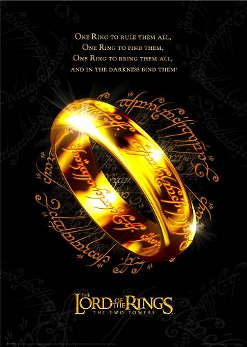
Lord of the Rings-
Instantly recognisable poster. Again, I liked this one for the bold color scheme; gold against black. This really catches a person's eye and as its based off a popular book, people know it. It doesn't even have a date or website (though given the time, websites weren't as popular yet for advertising film).

Tuesday, 11 January 2011

Storyboard Animatic


Please note that timing is not precise. The actual teaser will probably be a couple seconds longer.

Sunday, 9 January 2011

Audience Profiling

Click to enlarge.


So these are just a few examples of similar films my movie would share its audience with. Mainly young between from 12 onwards. Earlier I gave it a 12A rating which widens my audience as that's the most popular age rating.

Saturday, 8 January 2011

Audience


Based off the novel, I believe this film would be rated 12A as it contains some adult content (like violence and blood).

12A also has proven to attract the most at the Box Office as its the most accessible adult film rating.