Time Flies...
Wednesday, 26 January 2011
Teaser Poster Practice
Having a little practice with Adobe Illustrator. While I've used the logo for my film, this is most definately not how my Teaser Poster will look. But I now have a feel for the effects so my poster should look really good.
Sky Angels Logo
Monday, 24 January 2011
Film Diary
So today, 24/1/11, I shall be filming a majority of my teaser. Mainly the walking scenes around the school following my main character. I already got one shot done in front of the lockers so this shouldn't take long at all.
Friday, 21 January 2011
Teaser Poster Analysis
I chose these four teaser posters to analyze because they are the most similar to what I have in mind for my Teaser Poster.
Tron-
I love the close up of the hand in this one as it so simply shows its Tron without even revealing actors. I feel its a really well done Teaser Poster. I believe it would also be very easy to replicate in Photoshop.
The Box-
I love the basic color scheme of this poster; the black, white and red makes the brown box in the middle stand out. The big, bold red text also draws your attention. This is a quite unusual poster as it lists the main actress, the release date and director info however this could be linked to how its a big budget film and they can afford to select a date.
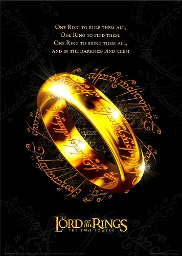
Lord of the Rings-
Instantly recognisable poster. Again, I liked this one for the bold color scheme; gold against black. This really catches a person's eye and as its based off a popular book, people know it. It doesn't even have a date or website (though given the time, websites weren't as popular yet for advertising film).
Tuesday, 11 January 2011
Storyboard Animatic
Please note that timing is not precise. The actual teaser will probably be a couple seconds longer.
Sunday, 9 January 2011
Audience Profiling
Saturday, 8 January 2011
Audience
Subscribe to:
Posts (Atom)